Want to know the difference between a microsite vs landing page?
Both are helpful for promoting your digital marketing campaigns, boosting sales, and increasing conversions. But, they also have some key differences that are important to understand.
In this article, we’ll explain microsites vs. landing pages and give you all the information you need to make the best choice for your blog, eCommerce store, or business website.
Microsite vs Landing Page
- What Are Microsites?
- What Are Landing Pages?
- Similarities & Differences
- Pros & Cons
- Microsite vs Landing Page: What’s Better?
What Are Microsites?
Microsites are like miniature websites, consisting of a homepage and typically 2-3 child pages that focus on a specific topic. They’re sometimes also referred to as branded blogs or independent campaigns.
Think of them like a website within a website. Even with multiple pages, they don’t have the functionality of a full website. Microsites can use a subdomain of the parent website or be an entirely separate domain from the main site. Either way, they often have their own unique designs and navigation menus.
Microsites typically expire after a marketing campaign ends, but they can also be permanent, like this interactive Adobe microsite example, My Creative Type. Here, visitors can learn more about creative personality types and take an interactive quiz to discover their type.

What Is a Microsite Used For?
The primary goal of a microsite is to increase brand awareness. For example, microsites can be used for:
- Targeting a specific audience by creating a dedicated microsite that appears in search engine results and delivers a tailored message.
- Building anticipation for an upcoming product launch with a countdown timer and sneak peeks.
- Testing a new marketing strategy, domain, or campaign message on a microsite before you incorporate it into the main company website.
- Educating your audience on a particular topic by providing focused content and resources.
- Sharing details, highlights, and registration information to generate excitement and interest for an upcoming event.
Take a look at the popular microsite Elf Yourself from OfficeMax. The site stays up year-round and displays a coming soon page until the Christmas campaign is active.

What Are Landing Pages?
Landing pages are hyper-focused web pages that prompt users to take a specific action. Landing pages are typically simple in design and feature a clear call-to-action (CTA).
Although rooted within the main website’s domain, landing pages usually don’t have links that lead away from the page. Their purpose is to encourage users to take immediate action rather than explore the entire website.
Check out this example of an eCommerce landing page that prompts users to start shopping immediately. As you can see, it doesn’t offer other links to explore, and it has a strong CTA with a countdown timer to create urgency.

What Is a Landing Page Used For?
Landing pages capture the attention of visitors and guide them toward desired actions. Uses range from email list growth to event registrations, free trials, specific product promotions, contests, and more.
Landing pages are often grouped into 2 main types:
- Click-through: Increase conversion rates by directing customers to make a purchase or sign up
- Lead generation: Aimed at collecting information, like email addresses, to convert visitors into paying customers.
Here are some popular reasons to use a landing page in your website design:
- Grow your email list by enticing users with free downloads.
- Advertise time-limited eCommerce flash sales with a compelling call-to-action.
- Allow visitors to register for a webinar or upcoming event.
- Encourage users to sign up for a free trial or demo.
- Market a new product or service.
- Promote a giveaway or contest.
Check out this landing page for online courses. It’s a single web page without navigation and only includes a CTA. making it laser-focused on lead generation.

Similarities & Differences: Microsites vs Landing Pages
It’s true that microsites and landing pages share some common elements, but there are still notable differences between the two. Let’s take a look.
What Is the Similarity Between a Microsite and Landing Page?
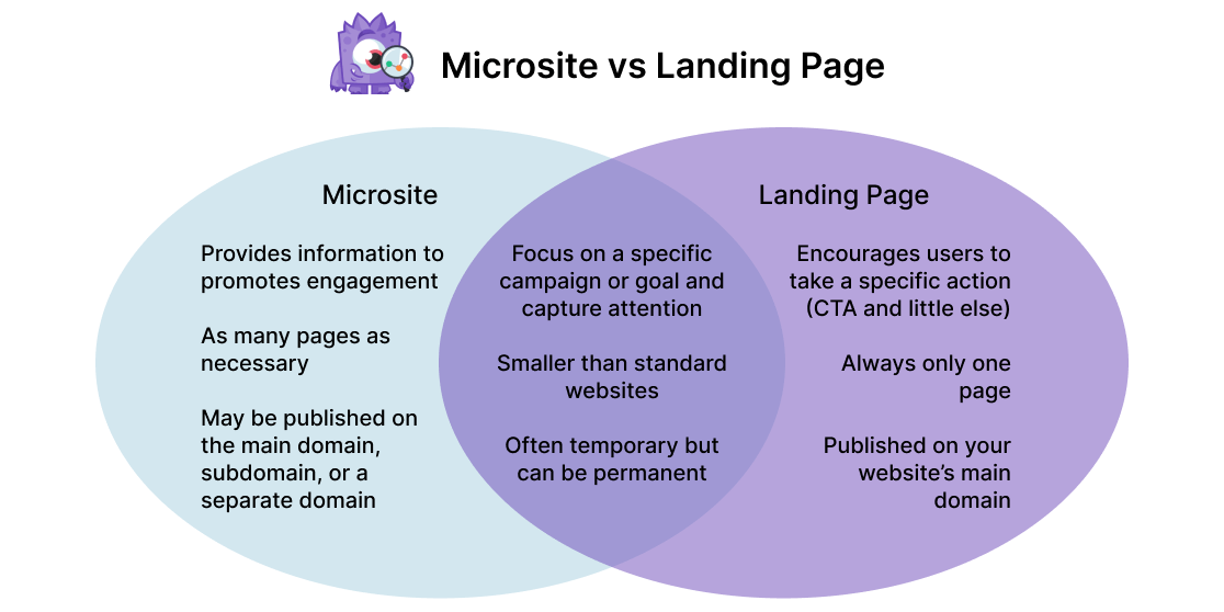
- Design: They both focus on a specific campaign or goal and are designed to capture attention.
- Proportion: Landing pages and microsites are both smaller than traditional websites.
- Life Cycle: They are often temporary, but both can be permanent as well.
What Is the Difference Between a Microsite and Landing Page?
- Focus: Landing pages typically focus on encouraging visitors to take a specific action and include little else. Meanwhile, a microsite serves as a small hub to promote engagement and provide information for customers.
- Pages: Microsites include as many pages as necessary, but landing pages are always a single page.
- Domain: Landing pages are always published on your main website. However, a microsite may be published as a subdomain or its own domain entirely.
Here’s a handy Venn diagram to help you visualize how microsites and landing pages differ from each other.
Pros & Cons: Landing Page vs Microsite
Microsites and landing pages are both great marketing tools, but you’ll want to think about your end goal when deciding between the two. Let’s break it down with some examples.
What Are the Pros and Cons of Landing Pages?
With a landing page, you want to convey information in the most concise and persuasive way possible. It’s an excellent conversion tool, but it also comes with trade-offs. Look at this example from Sunbasket meal kit delivery.

| Pros | Cons |
|---|---|
| 1. Highly persuasive with an incentive. | 1. Less informative |
| 2. Quick and easy to create. | 2. Limited to only one page. |
| 3. Uses the main domain which can help SEO by driving traffic to the specific URL. | 3. Not as engaging since it doesn’t include interactive elements, cool effects, or media. |
| 4. Can be tracked with UTM tags. | 4. Not as entertaining. |
| 5. Laser-focused conversion funnel leads visitors to the purchase goal. | 5. Less content to explore and no navigation could contribute to lower engagement metrics. |
What Are the Pros and Cons of Microsites?
On the other hand, a microsite typically falls somewhere in the middle between educating/entertaining and converting. Check out this Blue Heart Europe microsite from Patagonia. It educates customers on the environmental damage from hydroelectric dams.


| Pros | Cons |
|---|---|
| 1. Very informative with as much content as needed to convey the message. | 1. Multiple links and social media icons take visitors away from the site |
| 2. Engaging web design and a rich user experience with cool effects like parallax scrolling, photo galleries, videos, and interactive maps. | 2. More time-consuming to create and optimize. |
| 3. The domain and content can draw a different audience than the main website would. | 3. Requires more maintenance and purchasing a separate domain. |
| 4. Encourages exploration and has lots of call-to-actions. | 4. Multiple CTAs compete for conversions. |
How to Choose Microsite vs Landing Page
There really isn’t an overall better option. Each one has a specific purpose and both can be powerful marketing tools to build an online presence. To summarize…
Landing pages are hyper-focused initiatives that are typically more effective for advertising particular products, generating leads, and driving organic traffic to your primary website (search engine optimization).
Meanwhile, a microsite primarily informs potential customers. It can reach a target audience without relying on the parent site by using an additional domain name with specific content marketing.
Ideally, your business can eventually take advantage of both strategies as it grows. That said, microsites tend to be more time-consuming to create and produce less immediate results, which may make landing pages more appealing while your business is in the early stages.
The general rule of thumb to remember is that microsites are better for raising brand awareness and landing pages are better for converting.
How to Create a Landing Page or Microsite
Want to create a landing page or microsite for your website? Check out SeedProd!
SeedProd is the best page builder plugin for WordPress, and it’s extremely beginner-friendly. You can create stunning landing pages, microsites, or even entire websites and custom themes from scratch, without touching any code.
Here are some of our favorite SeedProd features:
- Intuitive drag-and-drop builder
- Library of pre-built templates including maintenance mode, coming soon pages, login pages, 404 error pages, splash pages, and more
- Custom WordPress themes
- Integration with eCommerce, email marketing automation services, and more
- Multiple landing pages with different domains
- And much more…
Get started with SeedProd today!
Whether you decide to create an informational microsite or a high-converting landing page, you’ll need to track your campaign’s success. Luckily, that’s a breeze with MonsterInsights.
You can set up advanced tracking for conversions, form submissions, eCommerce, video plays, and so much more across your entire website, subdomains, or multisite network in only a couple of clicks.
What are you waiting for? Download MonsterInsights now!
If you enjoyed learning about using a microsite vs. landing page on your website, you’ll definitely want to check out: How to Reveal Your Conversion Paths in Google Analytics.
Don’t forget to follow us on Twitter, Facebook, and Youtube for the best WordPress tutorials and Google Analytics updates.
