Google Analytics just introduced a new feature to make finding and understanding data a little bit easier for its users. With the new Plot Rows button, you can see your data in a more customized way without having to create a whole new custom report.
Whether you’re looking at page views, traffic channels, demographics, campaigns, or any other traffic visualization in Google Analytics, you can now choose which rows are plotted on the graph.
This is a game-changer for quickly spotting trends and making smarter decisions—no complicated setups needed. In this article, I’ll show you how the new Plot Rows feature in Google Analytics can work for you!
Why Plot Rows in Google Analytics?
So Google Analytics added a Plot Rows button. So what? What’s the big deal?
Well, this is actually something that the previous version of Google Analytics (Universal Analytics) did automatically, and it was pretty intuitive to use. If you wanted to see your traffic for a specific blog post over the last 3 months, for example, you’d just set your time frame to 3 months and then click on the URL you wanted to see a graph for, and it would pop right up.
So, when Google Analytics 4 came out, many users were surprised that they had to build a custom report with a special filter just to see the trend graph for a specific page, traffic source, or other metric.
Thankfully, the new plot rows button makes it easy again!
Using the new plot rows button can help you:
- Find and compare trends for individual pages, campaigns, traffic sources, and more
- Quickly spot downward or upward trends to either work on correcting or take advantage of
- More easily compare the traffic from two campaigns to see which one is performing better
- Visualize how different audience segments perform over time, such as users from different countries, devices, or demographics
- Compare the performance of different events, such as sign-ups, downloads, or purchases
- Spot trends in purchases for individual products
Really, this one little button makes using Google Analytics 4 quite a bit easier! So, let’s take a look at exactly how to use it.
Plotting Rows: Important Tips
Before I dive into the step-by-step tutorial, here are a few important tips to know about beforehand.
1. Plotting the Total
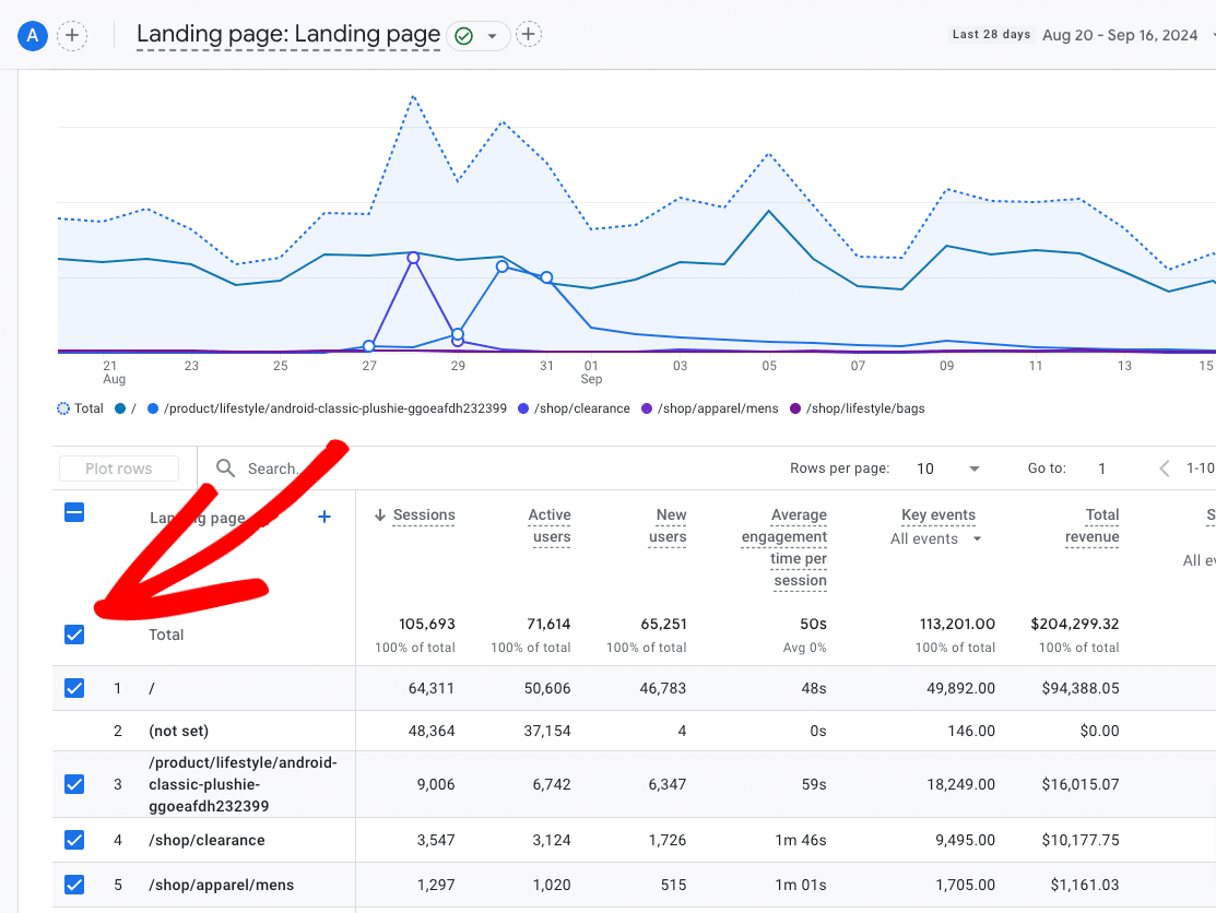
Whenever you open a new report, there will always be a (dotted) line plotted on your graph for the total. Having that total line on your graph can make it hard to really see the trends in your other lines, so you might want to start by unchecking it. To do that, un-check the box next to Total:
2. Unchecking All Rows
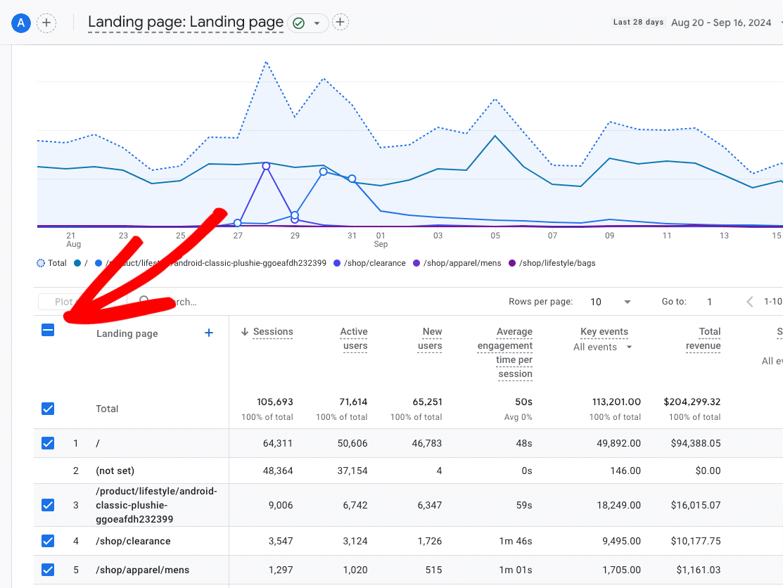
Sometimes, it’s helpful just to start with nothing checked at all. Then, you don’t have to take the time to uncheck each row you don’t want included. To start fresh and uncheck all of the rows, click the line symbol at the top of the column:
3. Row Plotting Limit: 5
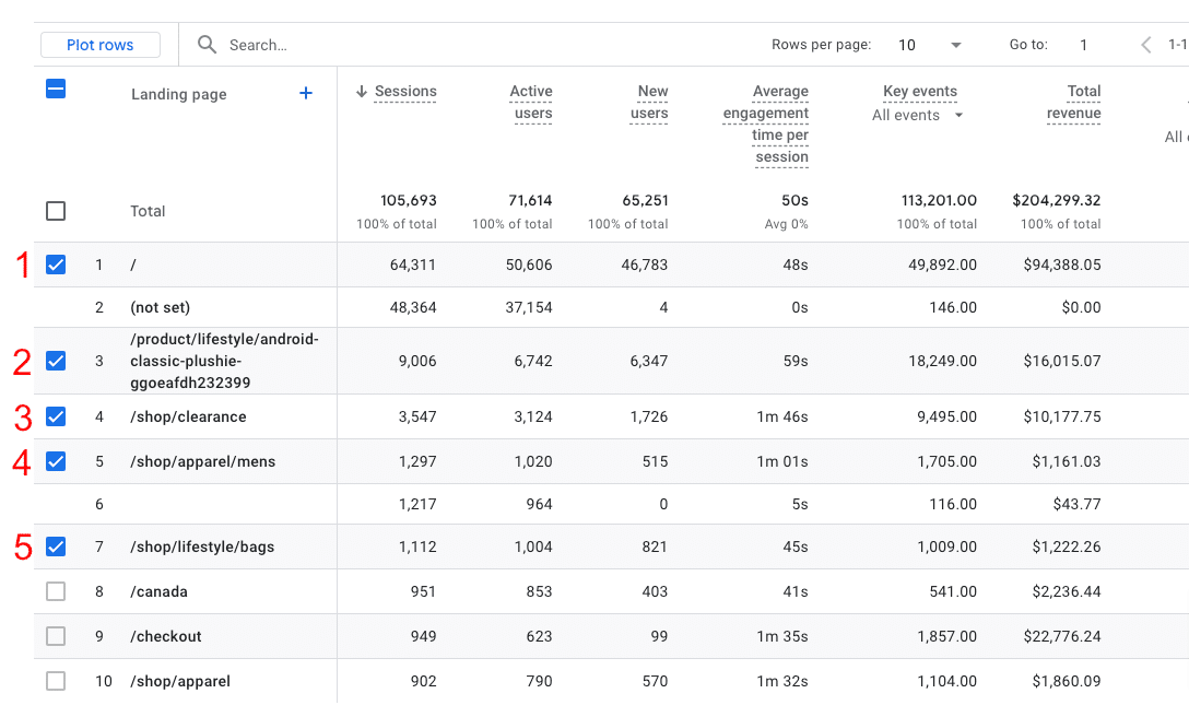
When you’re deciding what to plot on your graph, keep in mind that the limit is 5 rows. Once you’ve selected 5 rows, the boxes will gray out, and you won’t be able to select any more:
4. Plotted Rows Must Be in View
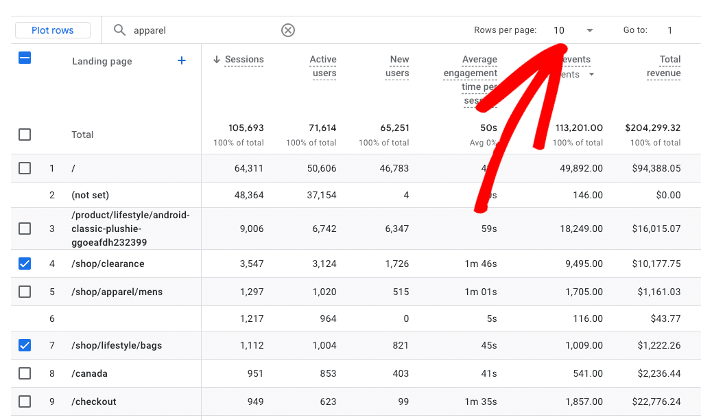
Have some specific rows you need to plot? Keep in mind that you can only plot rows that you can see in the list below the graph. Using the search function or navigating to another page will reset your row selections. So, make sure the rows you want to plot are all viewable by increasing the Rows per page:
That’s it for important tips! Now let’s take a look at the tutorial.
How to Plot Rows in Google Analytics 4
Using the new Plot Rows button in Google Analytics is actually pretty easy. Here’s how it’s done!
Step 1: Set up Your Report
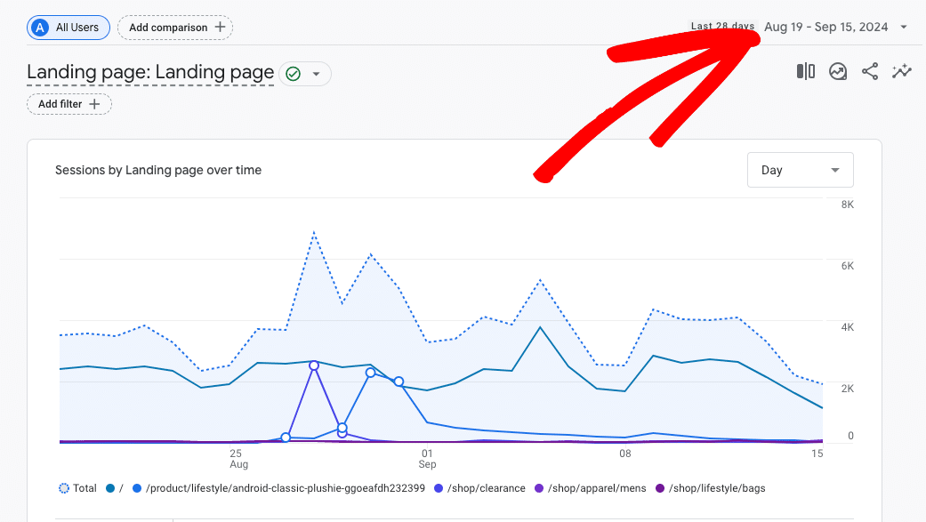
First, you just need to navigate to the report you want to plot rows on and pick the date range you want to look at.
For this article, I’m going to use the example of plotting the visits to specific pages. Personally, I missed this the most from Universal Analytics! I missed the ability to easily click on a specific page or post and see its traffic over time.
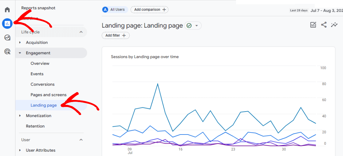
So, let’s head to Engagement » Landing page:
Then, choose the time frame you want to look at:
Once you’ve got that set, you can move on to step 2.
Step 2: Choose Rows to Plot
Now, it’s time to choose the rows you want plotted on your graph. In our case, for this report, we’re picking out a few pages.
First, I’ll set my Rows per page to something more than 10 so that I can make sure I can see the rows I want to plot. I’m also going to click on the line to unselect all and start with nothing checked:
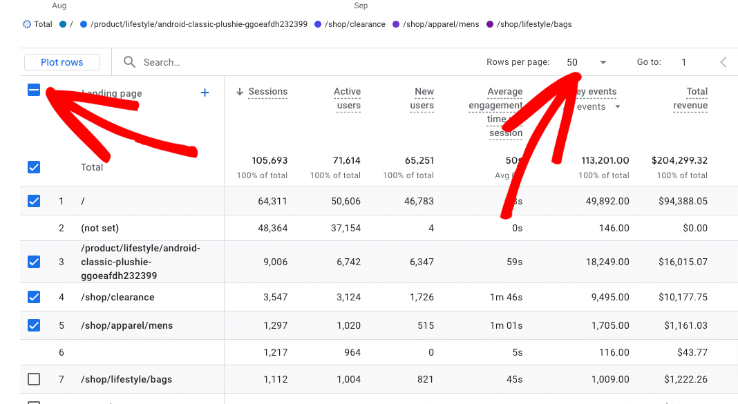
Next, I can select up to 5 rows that I want to plot on my graph. For this example, I’ll pretend I want to see traffic to my top 5 category shopping pages:
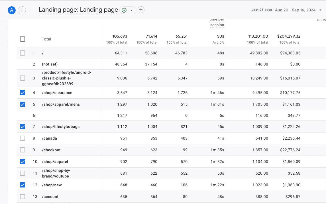
Finally, scroll up and click on the Plot Rows button:
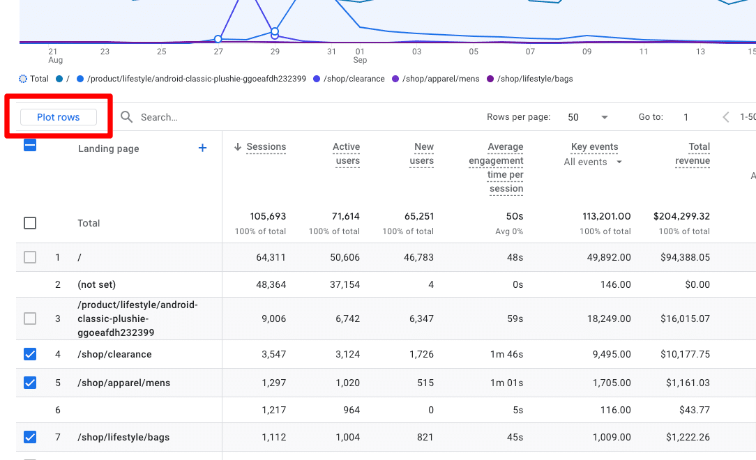
That’s it! The rows you picked are now plotted on the graph. Mouse over the lines to see which line goes with which page and numbers for each day:
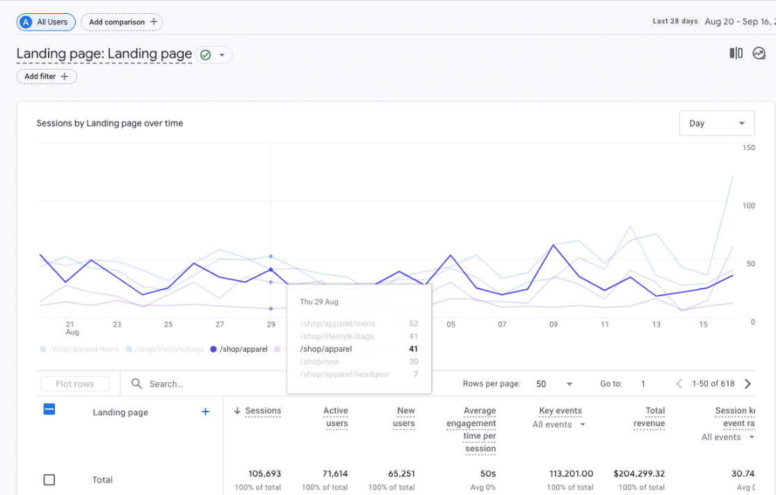
This helpful new feature can be used in most of the standard Google Analytics reports. Use it to graph out and track your campaigns, key events (conversions), pages, traffic channels, and more.
Bonus: Make Tracking Even Easier With MonsterInsights
If you have a WordPress website, there’s an even easier way to track your data right inside your WordPress dashboard: MonsterInsights.
MonsterInsights is the best Google Analytics plugin for WordPress. It not only puts tons of Google Analytics data right into your dashboard in easy-to-read reports, but it also sets up multiple tracking features that don’t come out of the box with Google Analytics. Track your button clicks, eCommerce purchases, form submissions, and much more.
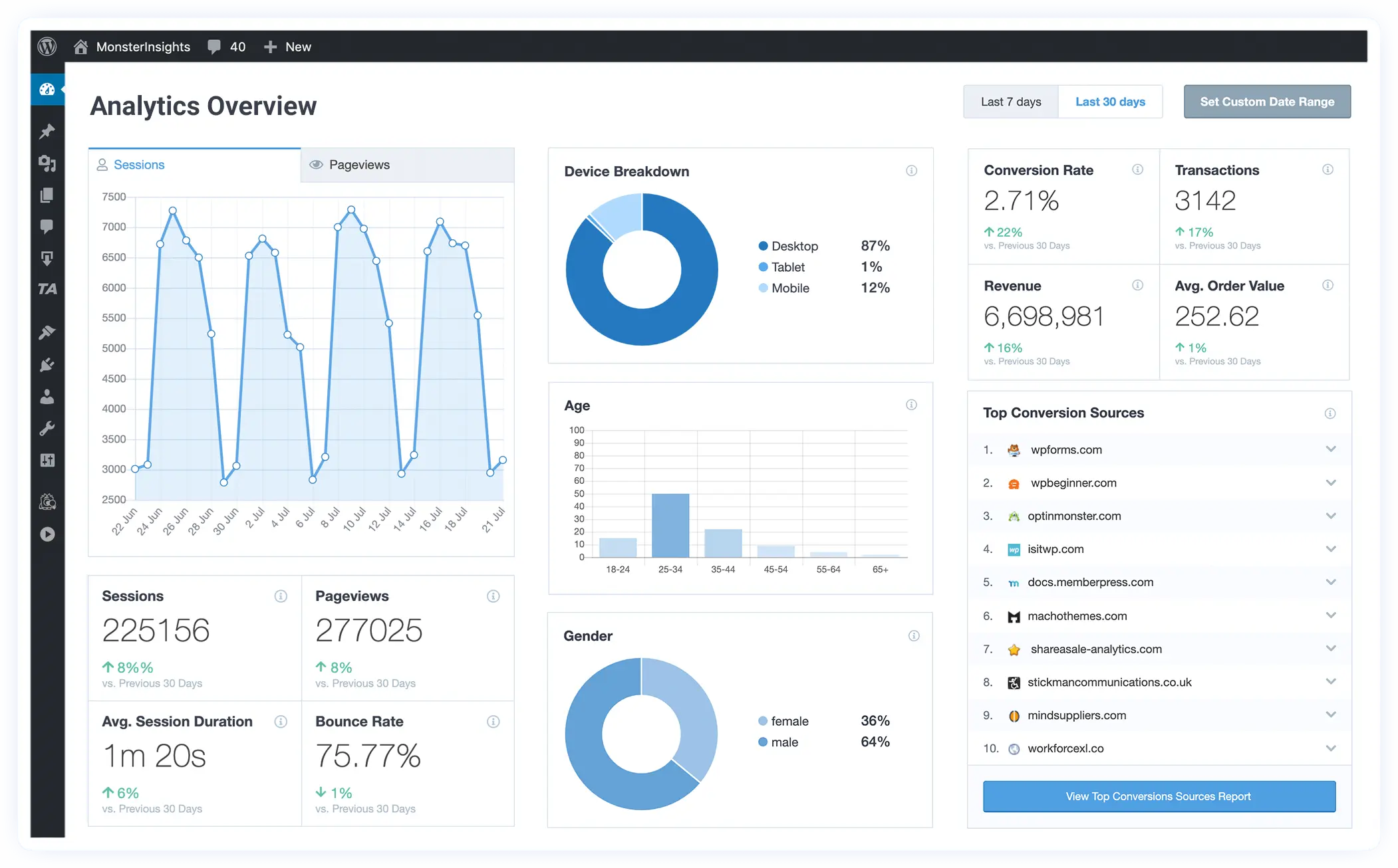
Get started with MonsterInsights now!
That’s it for this tutorial! If you enjoyed figuring out how to plot rows in Google Analytics, you might also want to check out:
8 Best Ways to Use ChatGPT with Google Analytics [GA4]
6 Essential Google Analytics Tips for Businesses & Marketers
How To Set Up QR Code Tracking With Google Analytics
How to See Which Google Analytics Traffic Sources Convert Best
Not using MonsterInsights yet? Get started today!
And don’t forget to follow us on YouTube for more helpful SEO, website, and Google Analytics tips.
