Do you want to know how to structure an effective landing page that converts? Landing pages are powerful tools for driving more traffic to your site and turning site visitors into paying customers.
In this article, we’ll show you the basic structure of an effective landing page so you can build a bigger email list, sell more products and services, and even boost your search rankings.
What is a Landing Page?
A landing page is a single page on your website that has one goal or purpose: to encourage people to take action.
Whether it be to download your newest eBook, register for an upcoming webinar, or simply subscribe to your newsletter, a landing page focuses on getting site visitors to do one thing and one thing only.
In fact, landing pages are either designed to collect lead data, such as names and email addresses, or encourage people to visit another part of your website, such as your eCommerce shop.
For example, Airbnb has a landing page that includes a call to action to get people started as Airbnb hosts:

Landing page traffic comes from many sources like search engine results, email campaigns, social media and content marketing channels, and even pay-per-click campaigns like the ones you might run with Google AdWords.
And if you use MonsterInsights, the best Google Analytics plugin on the market today, you can use Google Analytics segments to find traffic sources to your landing page.
But there’s more to creating effective landing pages that actually convert and bring in more sales than understanding which traffic sources visit them the most often.
That’s why we’re going to show you the basic breakdown of a good landing page that will not only bring traffic from many places but help you make more money online too.
You can also go through our list of best WordPress landing page plugins to create a page and get started.
1. Headline
In the past, we’ve discussed landing page headline formulas and their importance to boosting your conversions.
But just to recap, here are the main categories most landing page headlines fall into:
- Testimonial
- Cliffhanger
- Value Proposition
- Listicle
- How-to
Landing page headlines, like any headline, need to be clear and concise and deliver a distinct message to site visitors. In fact, a solid landing page headline will provide an instant solution to a site visitor’s problem, perhaps before the site visitor even knows they had that problem in the first place.
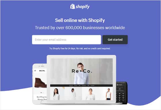
For example, Shopify’s landing page gets right to it by telling people they can sell online using Shopify.
Adding to that, they do a great job of capitalizing on social proof to further entice people to sign up for a free 14-day trial using a compelling subheadline, which is also an important part of an effective landing page.
After all, if 600,000 other businesses trust Shopify, they must be a good solution, right?
Your website’s landing page headline is the first thing people will notice once they visit your site. That’s why you should promise an easy solution and pain-free results to encourage people to move forward.
And to back your headlines with data, you can use the MonsterInsights headline analyzer tool. It lets you review your copy in your WordPress editor and get instant feedback.
For instance, you can check the character count of your headline and make sure they don’t get cut off by search engines.
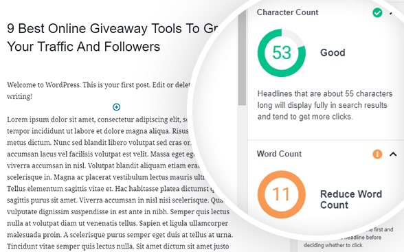
Besides that, the tool also helps you improve your copy by offering word banks. They contain words that can spark emotion and instantly capture a user’s attention.
To improve your copy, get a MonsterInsights Plus or higher license to use the Headline Analyzer tool.
2. Lead Magnet
Landing pages always offer something to site visitors. After all, that’s how you’re going to get people to take action, even if it’s just as simple as signing up for your email list.
Lead magnets are a way to offer something of value to people in exchange for their contact information or their business.
And the great thing is, that lead magnets often help entice people who aren’t quite ready to buy to at least stay connected with you, just in case they change their mind.
From there, you’ll be able to ramp up your email marketing efforts, build a stronger relationship with those who are unsure about your brand, and eventually turn them into paying customers.
For example, check out this great landing page example by Smart Blogger, which offers a valuable lead magnet to people who will click the call to action button.
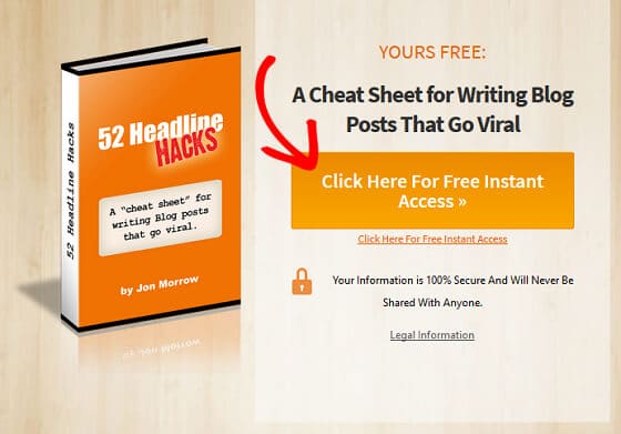
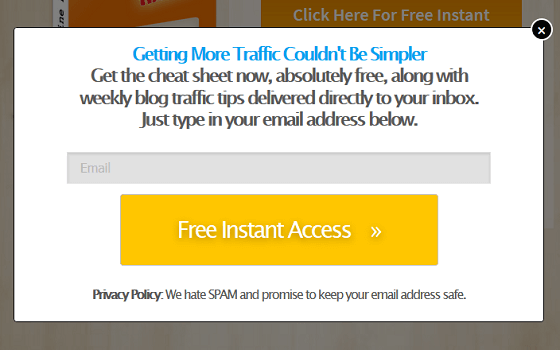
Once you click on the call to action, you immediately see a popup to enter your email address for access to the cheat sheet. You also find out that you’ll get weekly emails with tips. This is Smart Blogger’s way of providing subscribers value and forging a relationship.
For more on what to offer site visitors in return for their email addresses, check out this helpful list of lead magnet ideas.
And if you really want to know how your site is doing in terms of landing pages, be sure to check out the Publishers Report in MonsterInsights to see what your website’s top landing pages are.
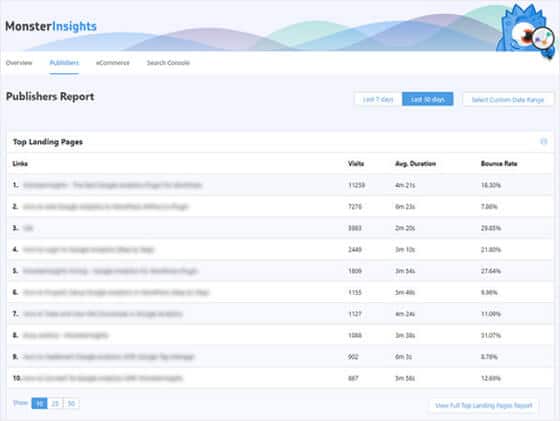
That way, you can see which lead magnets resonate the best with site visitors so you can give them more of what they want in return for more signups and sales.
3. Optin Form
No matter what your end goal is for your site’s landing page, you’re going to need an optin form of some sort. Even if just to collect an email address.
The length of your form will depend on things like the design of your landing page, the lead magnet you’re offering, and even your industry.
It will also depend on how well different landing pages convert, which can be tested by running an A/B test.
Take H.Bloom for instance. They ask for more than just a name and email address, but it works for their industry. Especially because they aren’t looking to simply add you to an email list. They are asking you to book a complimentary consultation.

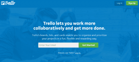
On the other hand, Trello simply asks for an email address because they don’t need anything else to get you what you need.
4. Call to Action
Besides your landing page’s headline, the call to action (CTA) is probably the next most important part of an effective landing page. The call to action tells people who land on your website exactly what you want them to do, what they’ll get in return for doing it, and how to do it.
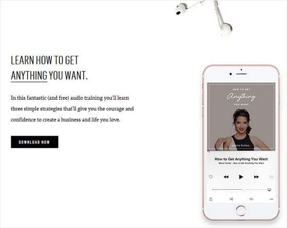
The call to action is usually a clickable button, and either signs them up automatically for your email list or triggers a sign up form that needs to be completed, like the one Marie Forleo has for site visitors.
Once you click on the “Download Now” call to action button:
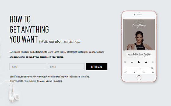
You are brought to the actual sign up form where you enter your contact details:
You may only include one CTA button on your landing page, or you might want to have a few. But no matter what you do, make sure it’s clear to anyone who visits your site’s landing page that clicking on that button is required.
And there you have it! You now know how to structure an effective landing page that converts.
If you happen to offer an eBook or other downloadable file as a lead magnet on your landing page, be sure to check out how to track and view file downloads in Google Analytics accurately.
And don’t forget to follow us on Twitter and Facebook for more helpful Google Analytics tips.

This article has help a lot as I am a newbie in the market. Thank you.