Are you struggling with low sales on your eCommerce site and wondering how to boost your conversion rates? eCommerce conversion optimization is crucial for the success of your online business because your revenue depends on how well your site converts visitors into customers.
In this article, we’ll explore 21 proven tactics for eCommerce conversion optimization. You’ll discover actionable strategies to optimize your eCommerce website, enhance user experience, and ultimately increase your conversion rates for your online store.
Here’s what we’ll cover:
- What Is eCommerce Conversion Optimization?
- What Is a Good eCommerce Conversion Rate?
- 21 Effective eCommerce Conversion Optimization Tactics
- Track Your Conversion Rate with Google Analytics
What Is eCommerce Conversion Optimization?
Conversion optimization for eCommerce websites focuses on increasing the percentage of website visitors who make a purchase or complete another valuable action on your site. Let’s break down the key concepts.
A conversion happens when a visitor performs a desired action, such as making an online purchase, adding products to a cart, signing up for an email list, or sharing content on social media.

Essentially, any key performance indicator (KPI) that matters to your business can be considered a conversion.
To calculate your conversion rate, use this formula:
Conversion rate = (conversions/total visitors) × 100 %
For instance, if your store receives 5,000 visitors and 50 of them make a purchase, your conversion rate is 1% ((50/5.000) x 100).
Conversion rate optimization (CRO) aims to enhance the user experience on your site to boost these conversion rates. This process can be applied to various touchpoints, including landing pages, category pages, and product pages.
Understanding your current conversion rate is the first step. Analyze your site to see where visitors are getting stuck and how they interact with it.
Use this data to set benchmarks and measure the success of your optimization efforts.
What is the best way to measure your conversion rate? Using Google Analytics and MonsterInsights.
To learn more about tracking your eCommerce conversions immediately, jump to the Track Your Conversion Rate with Google Analytics section.
Otherwise, keep reading, and we’ll cover that at the end of this article.
Next, let’s explore what is considered a good eCommerce conversion rate.
What Is a Good eCommerce Conversion Rate?
A good eCommerce conversion rate varies by industry, but generally, a rate between 2% and 5% is considered strong. However, what qualifies as “good” depends on many factors, including your niche, target audience, and marketing strategies.
The goal is to improve your conversion rate through continual, consistent optimization.
Small, incremental changes to your site’s user experience can significantly impact your conversion rate over time.
By analyzing your current eCommerce performance and identifying areas for improvement, you can set realistic benchmarks and measure your progress.
Remember, even top brands like Amazon and Nike constantly work to improve their conversion rates.
Now, let’s explore some strategies to help you boost your eCommerce conversion rate and achieve better results.
21 Effective eCommerce Conversion Optimization Tactics
Are you satisfied with your current conversion rate? If not, then it’s time to make some upgrades. And even if your conversion rate meets or exceeds industry standards, there’s always potential for improvement.
Now, let’s look at some proven conversion optimization techniques to use on your eCommerce site today.
1. Simplify the Checkout Process
Simplifying the checkout process is the first and most crucial step in eCommerce conversion optimization. A complicated checkout can frustrate users, leading them to abandon their carts and leave your site. Definitely not want you to want!
To enhance your conversion rate, make the checkout process as quick and straightforward as possible.
Start by reducing the number of steps required to complete a purchase. If feasible, aim for a single-page checkout.
Streamline the forms by only asking for essential information since long forms can demotivate potential buyers. Implement auto-fill options for addresses and payment information to save users time.
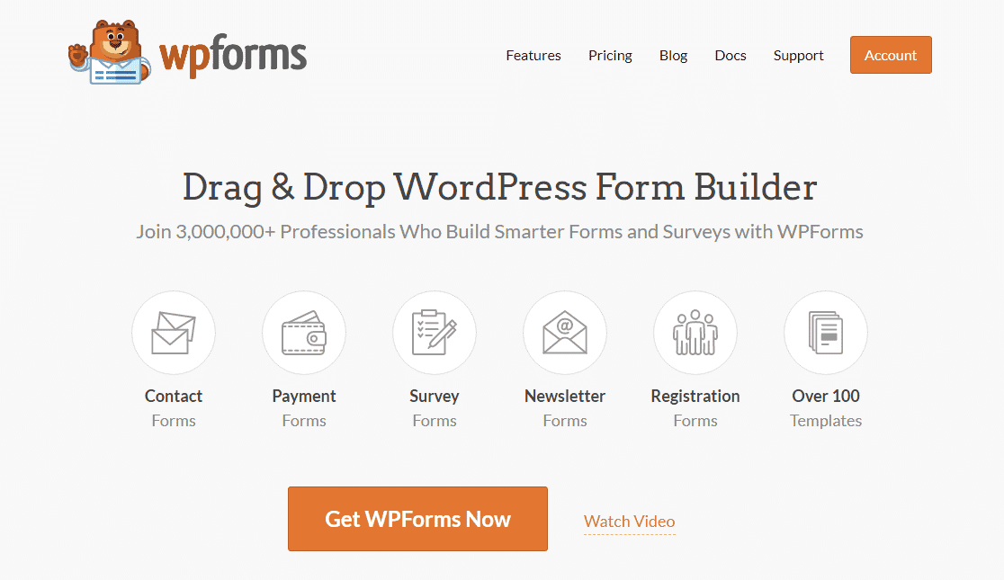
For WordPress users, we recommend using WPForms.
This fantastic tool allows you to easily create a single-page checkout form without any coding. The drag-and-drop builder lets you collect payments with Stripe, enabling you to create payment forms, user registration forms, and more.
With over 1,700 templates to choose from, you’ll find any form type you need, making it easy to get started.
By implementing these strategies and utilizing WPForms, you can significantly improve your website’s conversion rates and provide a better shopping experience for your customers.
2. Increase Trust Using Different Signals
No one wants to buy from an unsafe website. So, building trust with your visitors is vital for converting them into customers.
One effective way to do this is by using various trust signals throughout your website.
Show Security Badges: Displaying security badges on your site can significantly reduce cart abandonment.
When shoppers see these badges, they feel reassured that their credit card details and personal information are secure.
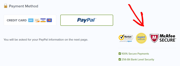
Security badges from well-known organizations like Norton, McAfee, or TRUSTe can enhance your site’s credibility.
These badges signal to customers that their online transactions are protected, encouraging them to complete their purchases confidently.
Trust Seals: Trust seals, on the other hand, are symbols that signify your business has been verified by a third-party organization for overall trustworthiness, not just security.
Examples include the Better Business Bureau (BBB), TRUSTe, and VeriSign. These seals often certify that your business meets specific standards, adding an extra layer of assurance for your customers.
Visible Contact Information: Providing easily accessible contact information, including a physical address, phone number, and email, reassures customers that they can reach out if they have any issues or concerns. This transparency can significantly enhance trust and credibility.
By integrating these trust signals into your eCommerce site, you can create a more trustworthy environment for your customers, reducing hesitation and increasing conversion rates.
3. Make Your Checkout Form Easy to Understand
Creating an easy-to-use checkout form is essential for reducing cart abandonment and increasing conversions.
Whether on desktop or mobile, your checkout form should be intuitive and include as few fields as possible.
Simpler forms provide a smoother, more seamless checkout experience, leading to higher conversion rates.
Simplifying your checkout form can significantly impact your sales. Ensure all elements, such as CVV codes and input formats, are clear.
Limit input options to streamline the process. For example, credit card numbers can be formatted automatically, and date pickers can be used instead of allowing users to type dates.
Avoid making users uncomfortable during checkout, especially with personal credit card information. Digital wallets like PayPal, Amazon Pay, and Apple Pay can help by pre-populating user details, making the process faster and more secure.
4. Display Product Reviews Clearly
Displaying product reviews clearly on your site is essential for building trust and boosting conversions. A study shows that 98% of web visitors leave without taking action, and 70% never return because they don’t trust the brand.
Adding social proof, such as customer reviews, can quickly solve this problem. Reviews inform visitors that others have used and approved your products, increasing their confidence in your brand.
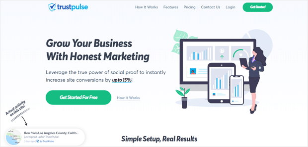
TrustPulse is a powerful social proof plugin that tracks purchases, downloads, and registrations on your site and displays them as recent activities or event counts.
This helps to build trust and credibility with potential customers.
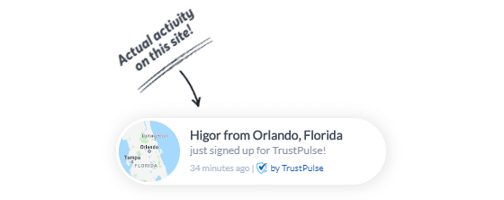
TrustPulse works with platforms like WordPress, Squarespace, BigCommerce, and Shopify.
Product testimonials are equally valuable for service-based businesses. They showcase why customers chose your business and the benefits they received, establishing your brand as trustworthy and reliable. So, see if you can include a few on your eCommerce site.
In product rating research, 9 out of 10 users rely on reviews to evaluate products.
So, customer reviews and social proof are really important for the success of your eCommerce store.
5. Use Cart Abandonment Strategies
Another proven tactic to increase conversions is implementing cart abandonment strategies on your eCommerce shop. For example, when a user is about to abandon your cart, you can show them a popup with an exciting discount coupon.
You can easily create cart abandonment popups on your website using the most popular conversion optimization tool, OptinMonster.
OptinMonster comes with a signature exit-intent technology that allows you to display stunning popups at the exact moment a user is about to exit.

You can use exit-intent forms on your shopping cart to reduce the cart abandonment rate. Also, you can use it on other pages to optimize your website conversion.
To learn more, read our full guide on 9 Essential Abandoned Cart Recovery Strategies.
6. Add FOMO Countdown Timers
FOMO stands for fear of missing out. It’s a psychological term that explains the anxiety about missing out on something exciting.
As a business owner, you can use this human behavior as a marketing tactic to boost your eCommerce conversions by using a FOMO pop-up or timer.
A countdown timer creates a sense of urgency and entices your users to buy a product immediately before the time is up.
You can create attractive countdown timers using the conversion optimization plugin OptinMonster.
It comes with a countdown timer template, which you can customize to make a countdown timer instantly.
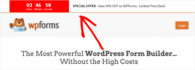
For more details, see our step-by-step guide on How to Add a Countdown Timer in WordPress to Boost Sales.
7. Use Clear and Effective Calls to Action
The call to action (CTA) buttons, along with product images and descriptions, are among the most critical elements of a product landing page. Placing these elements attractively can significantly increase conversions.
First, ensure your CTAs are clear and visible, like in this example from Harvest:
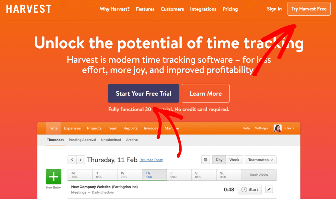
However, you want to avoid overwhelming visitors with too many options and buttons on one screen.
Whether it’s ‘Add to Wishlist,’ ‘Share Icons,’ ‘Add to Cart,’ or ‘Learn More,’ keep your CTAs in the same area on the page to prevent clutter.
Also, guide users toward the action you want them to take. On a product page, use ‘Add to Cart.’ On the cart page, use ‘Proceed to Checkout.’
By strategically placing CTAs, you can create a streamlined user experience that drives conversions.
8. Use Good Product Images
High-quality product images and clear, concise descriptions are essential for creating a positive impression and boosting eCommerce conversions.

Users form opinions about a brand based on the images they see on the site. High-quality images reassure visitors they purchase the correct item and can significantly impact conversion rates.
However, low-quality photos or images that lack zoom functionality lead to higher cart abandonment rates.
Customers cannot touch or try on the product when shopping online, so detailed images or videos are crucial.
